Daily Summary
Garmin Connect Web App • UX DesignThe original goal of the project was to address the space limitation of a horizontal tab layout as new features were added to the page. It was apparent that the existing design was the result of tacking new features onto an older design without ever refactoring the layout. After I provided a UX audit of the page, the Product Owner approved a complete redesign.
The Redesigned Desktop Layout
The redesign allowed for cards to expand to show a simple chart, or link to a separate page to display more extensive user data.

Aligning the Design System
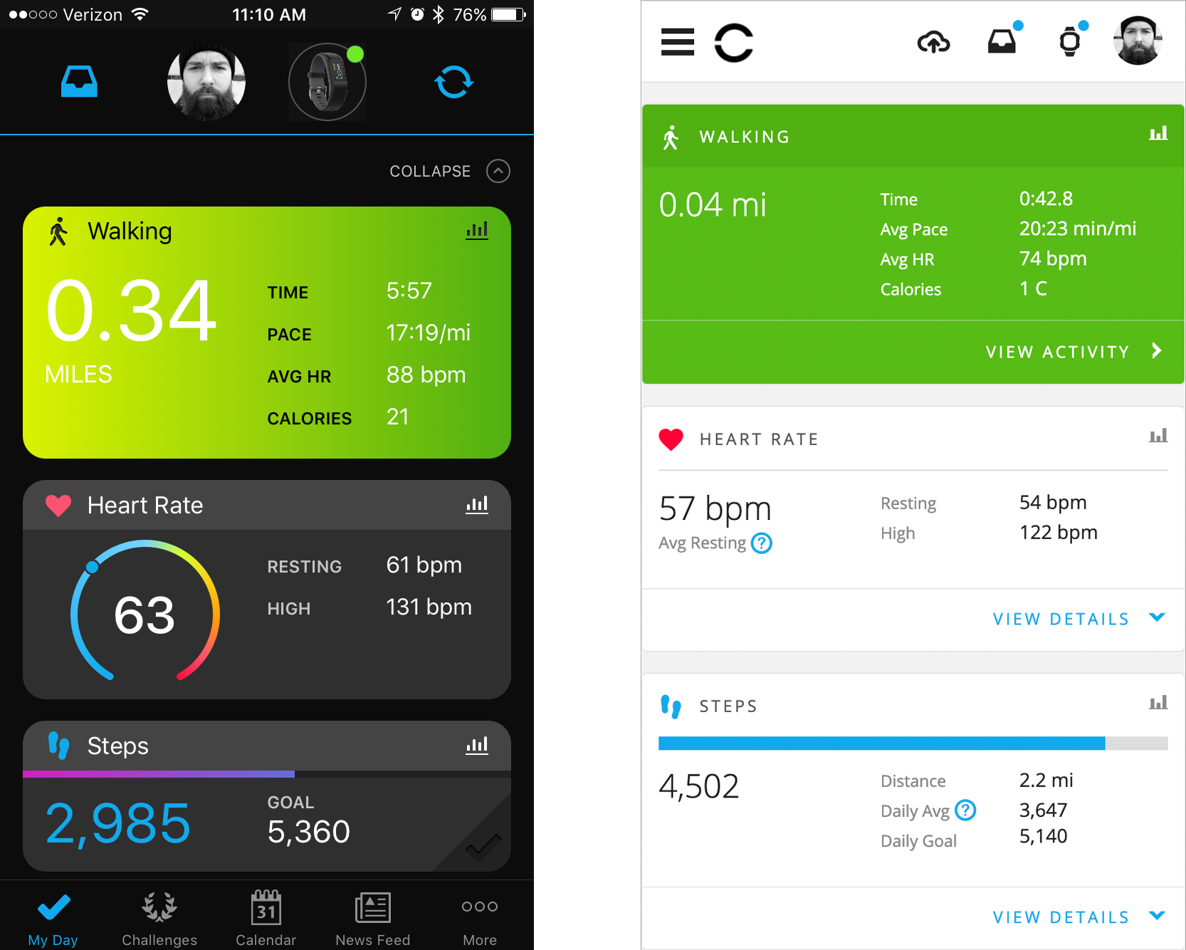
One major requirement was to make the redesign somewhat consistent with our mobile application’s equivalent page, which was card-based. Matching that approach helped with the grouping of similar data on the page, which was previously spread out. The content that had been handled by horizontal tabs was arranged into cards, which could expand to reveal additional details, or link to a separate page.
My Day versus Daily Summary
The Garmin Connect App My Day page (left) influenced the layout of the Daily Summary redesign, particularly in the mobile layout (right).

Leveraging Data
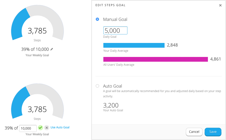
The previous goal editing feature let users set a manual or automated step goal, but did not provide any guidance or context. The redesign provided a user with their daily average, as well as all Garmin users’ daily average — which could serve to motivate or affirm a user’s performance — and an up-front explanation of the auto goal and what it’s initial value would be. User testing demonstrated a clear preference for the redesign.
Goal Edit Redesign
The existing goal edit UI was a basic text field (left). The redesign provided a focused experience with helpful information (right).

Navigation Improvements
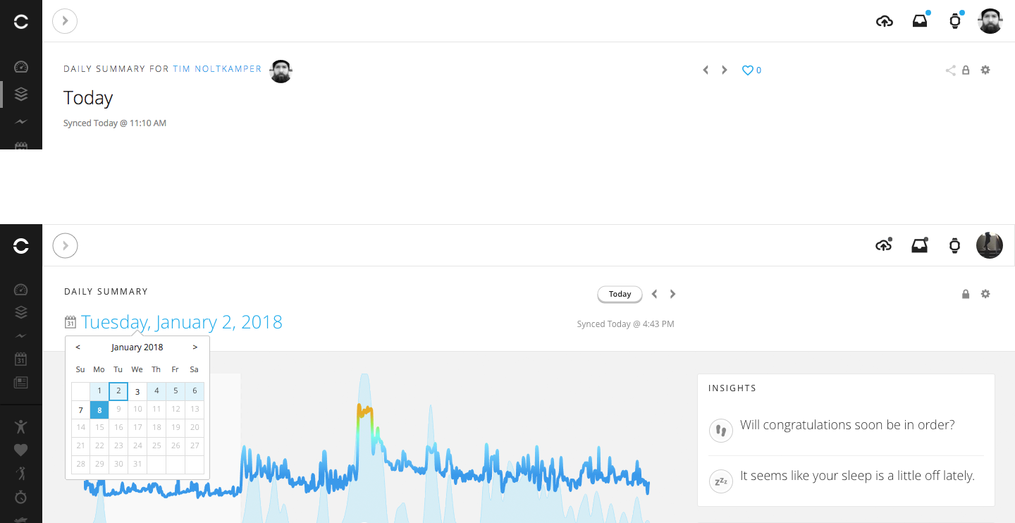
The old design only allowed a user to navigate between dates with arrow buttons, and did not have an option to quickly return to the current date. The redesign has a fixed header with a date picker, which also indicates which dates have recorded data, so that a user does not navigate to an empty page.
Date Navigation Redesign
The previous design (top) had very limited date navigation, while the redesign (bottom) allows users to jump to any date.
